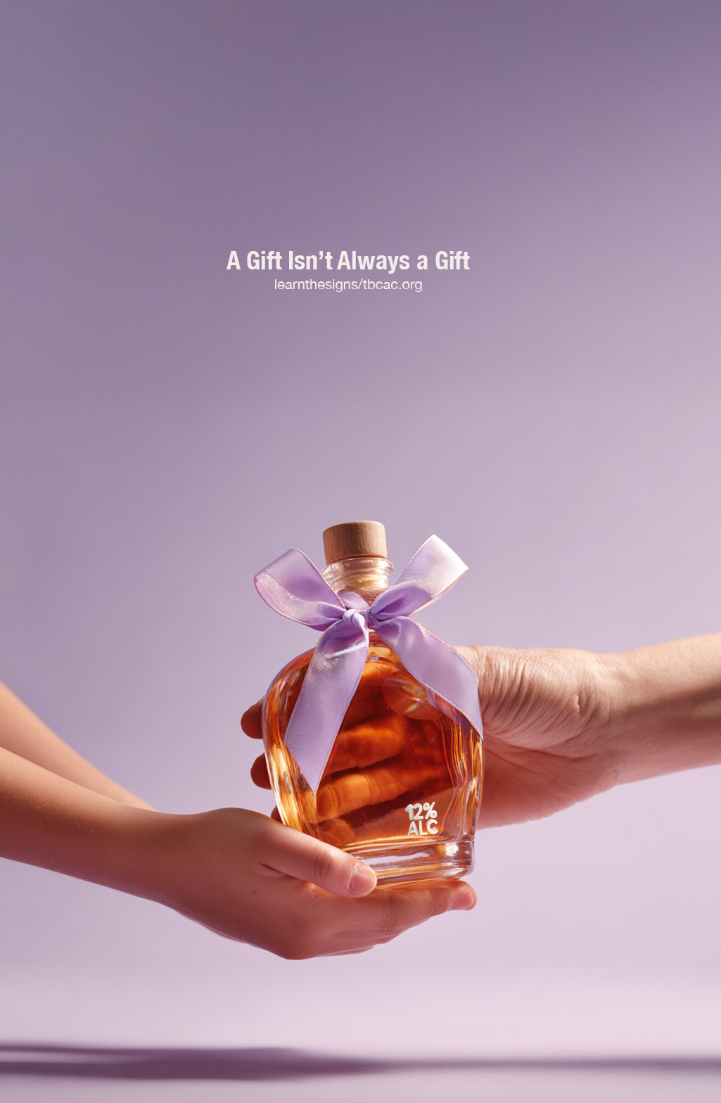
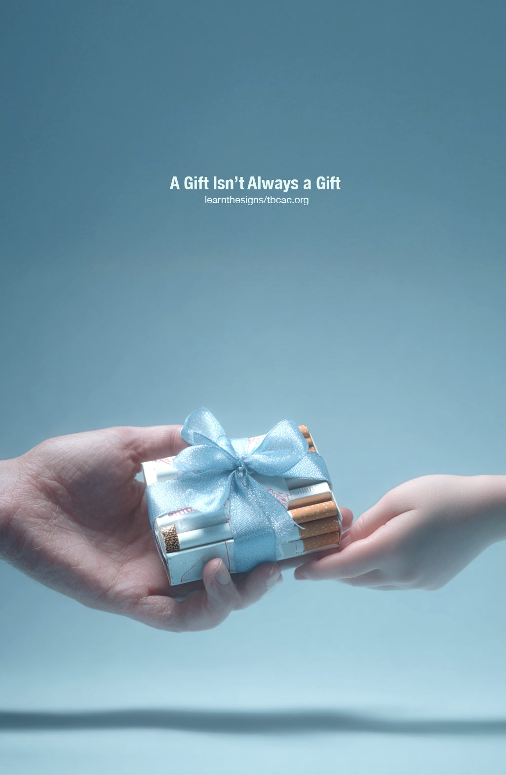
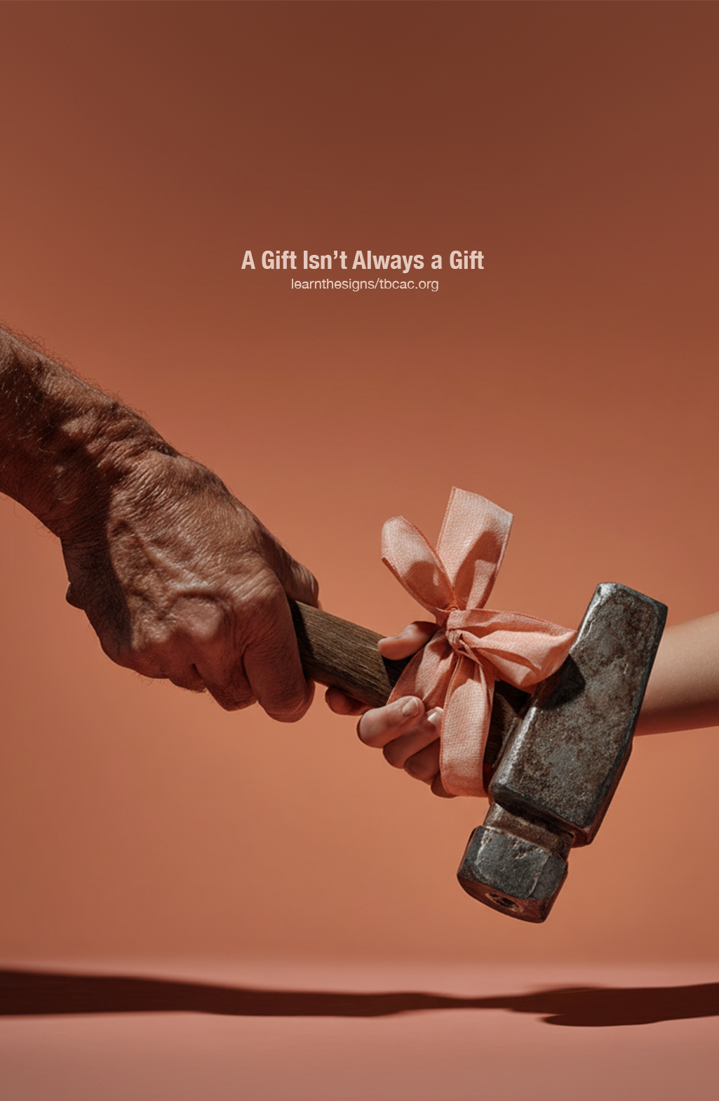
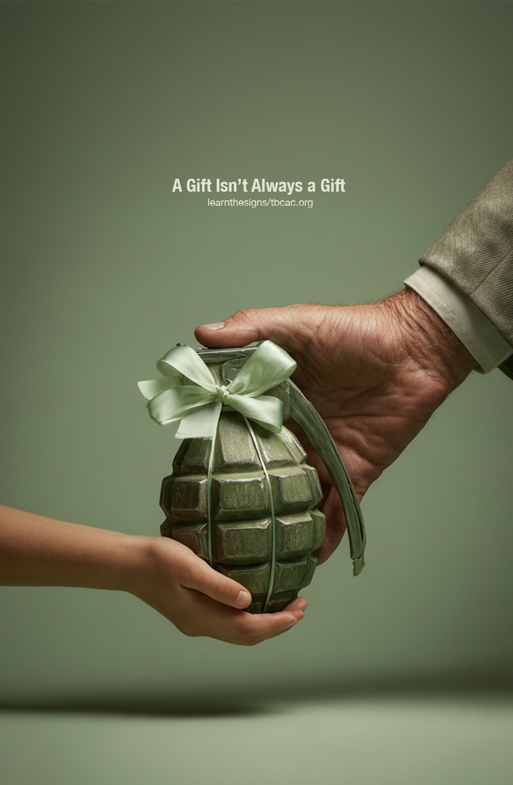
A Gift Isn’t Always a Gift
Ad campaign created for the Traverse Bay Children’s Advocacy Center, focused on gift-giving as an early sign of child sexual abuse. Using the tagline “A Gift Isn’t Always a Gift,” I paired adult hands offering dangerous objects, decorated with pastel bows against soft, childlike backgrounds. This contrast shows how something that appears sweet or harmless can hide harmful intentions, encouraging viewers to stay alert to the warning signs.


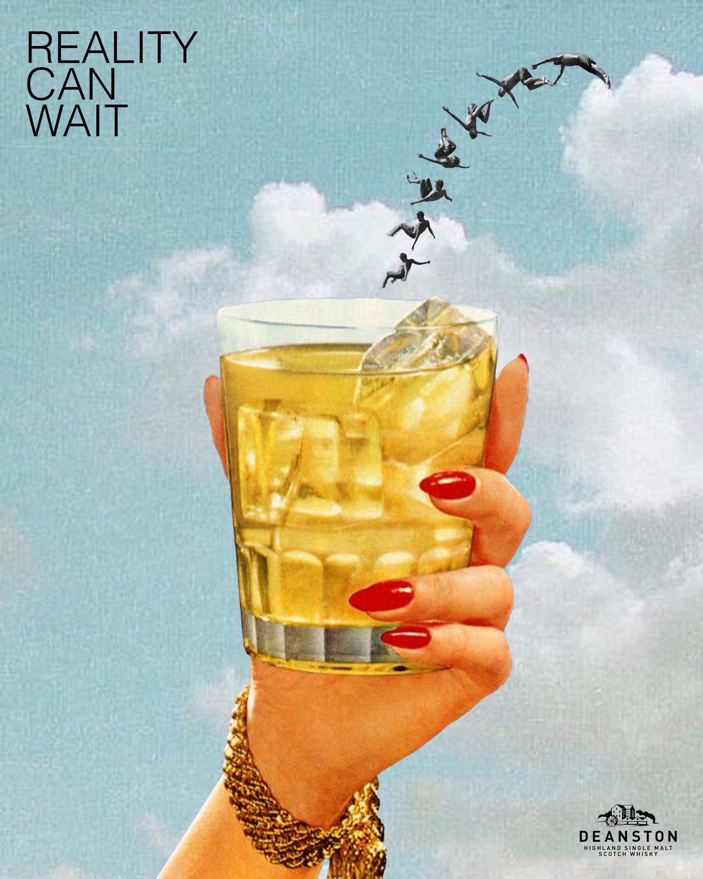
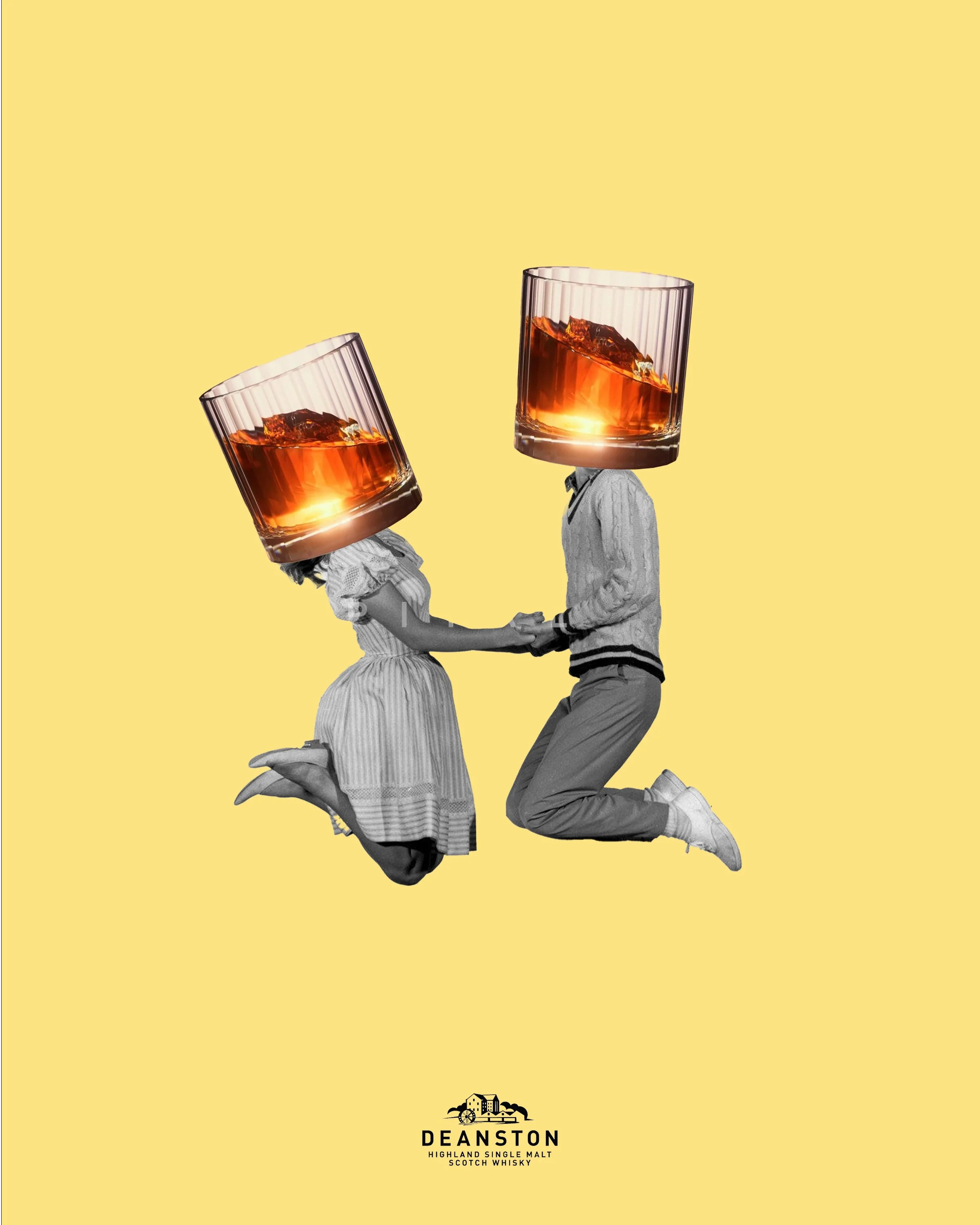
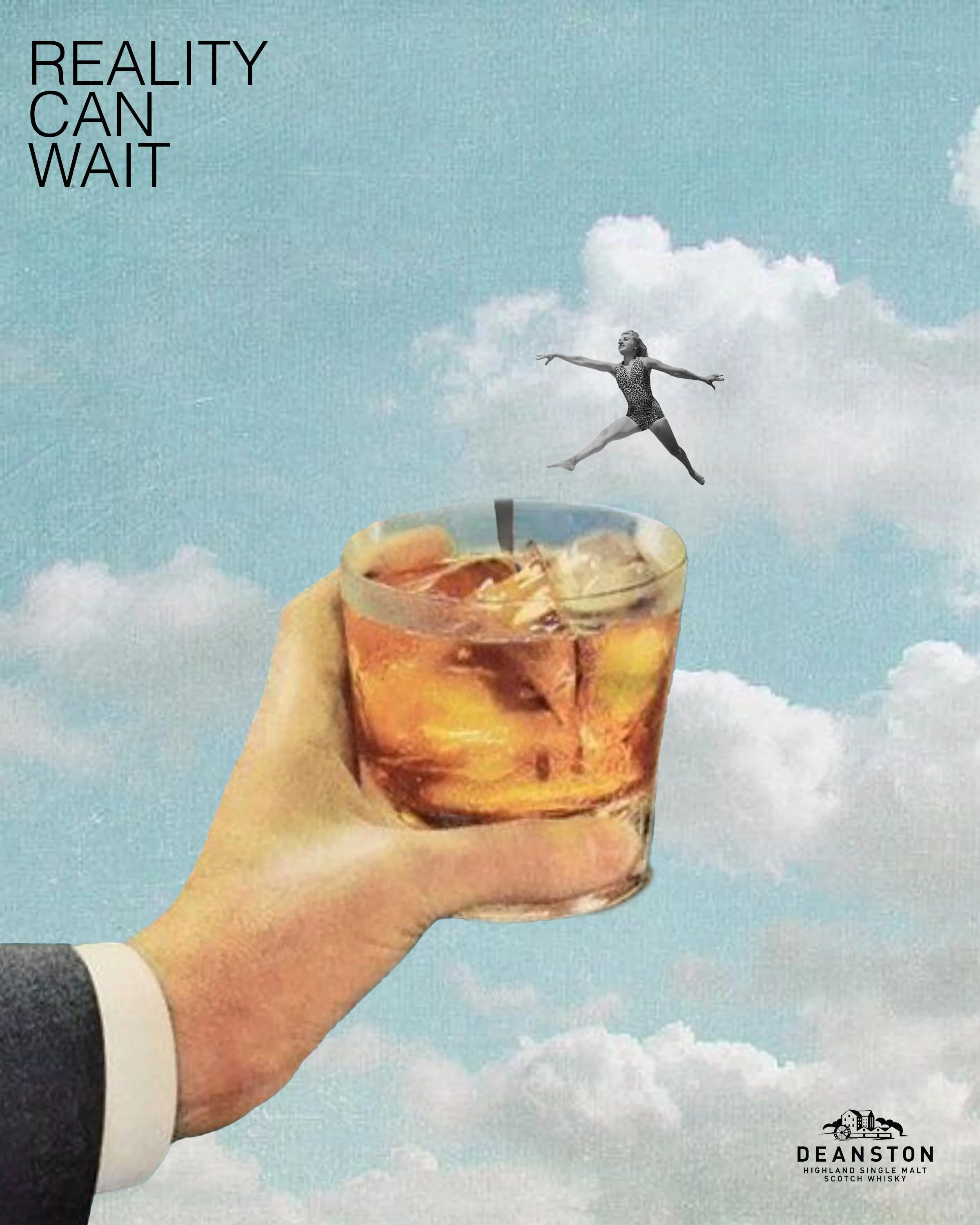
Deanston: Reality Can Wait
This art direction and graphic design project reimagines the brand identity of Deanston whisky for a younger audience. Drawing on surrealist visual language, the campaign uses playful and slightly unexpected imagery to create a lighthearted, cheeky tone that contrasts with the traditionally serious world of whisky advertising. The visuals center on moments of friendship, spontaneity, and fun—capturing the feeling of stepping away from the routines of everyday life. Through vibrant, surreal scenes and a sense of escapism, the campaign invites viewers to embrace the idea that sometimes reality can wait, reflected in the tagline “Reality Can Wait.”
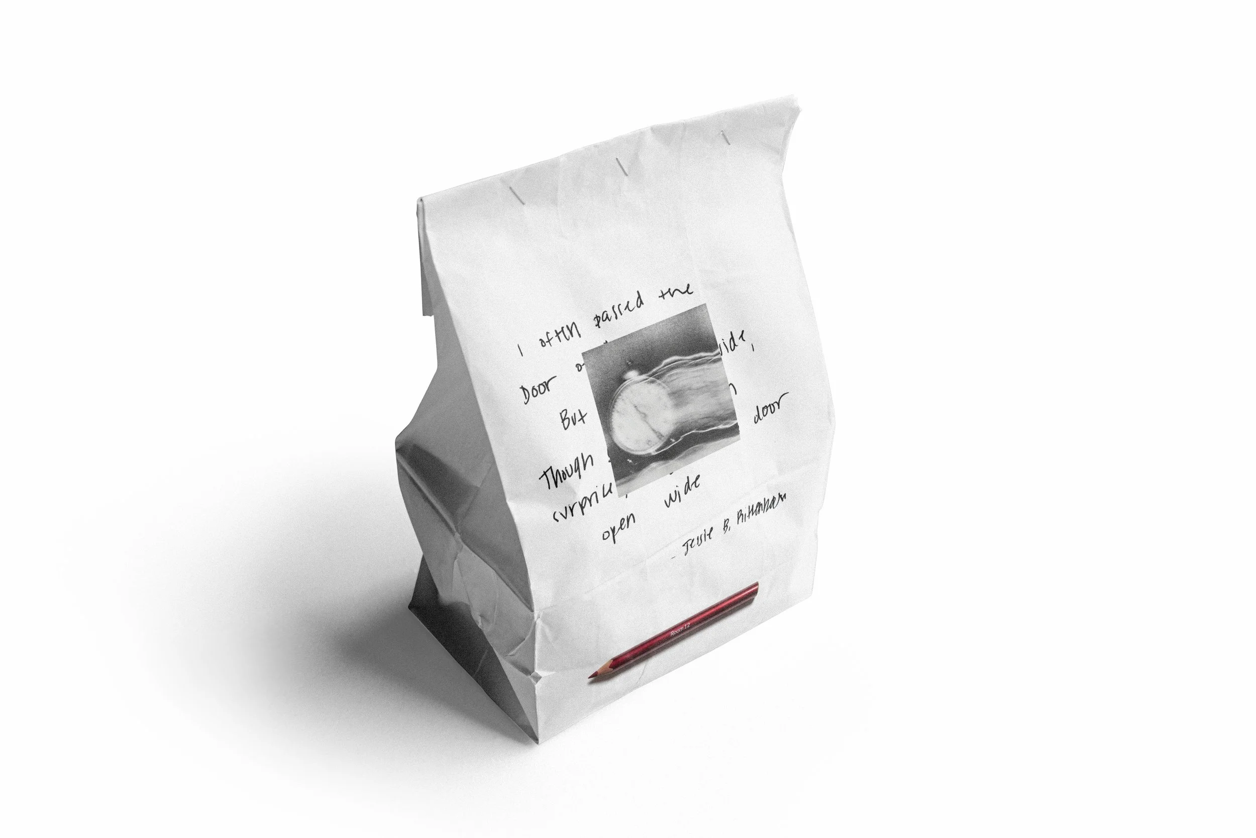
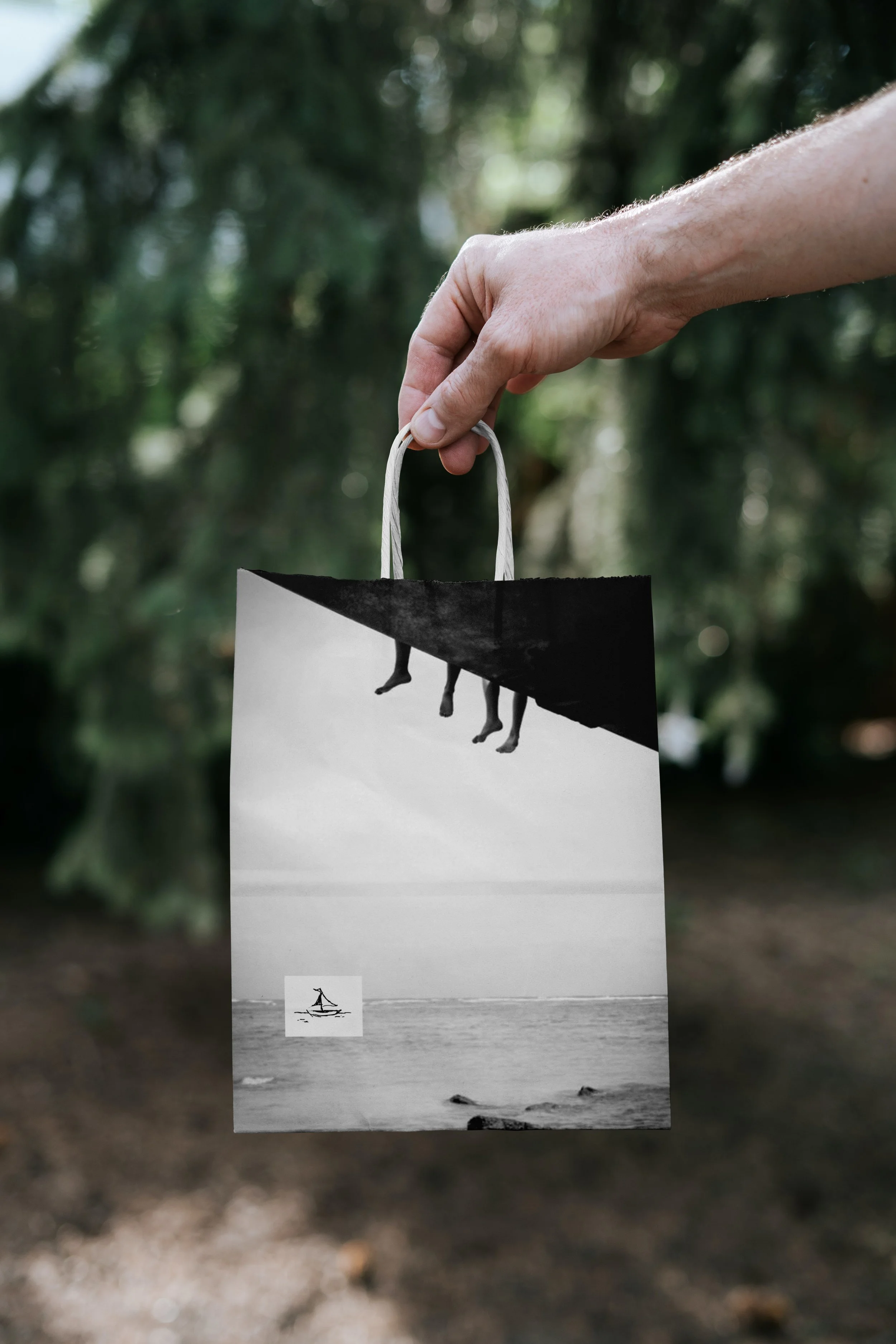
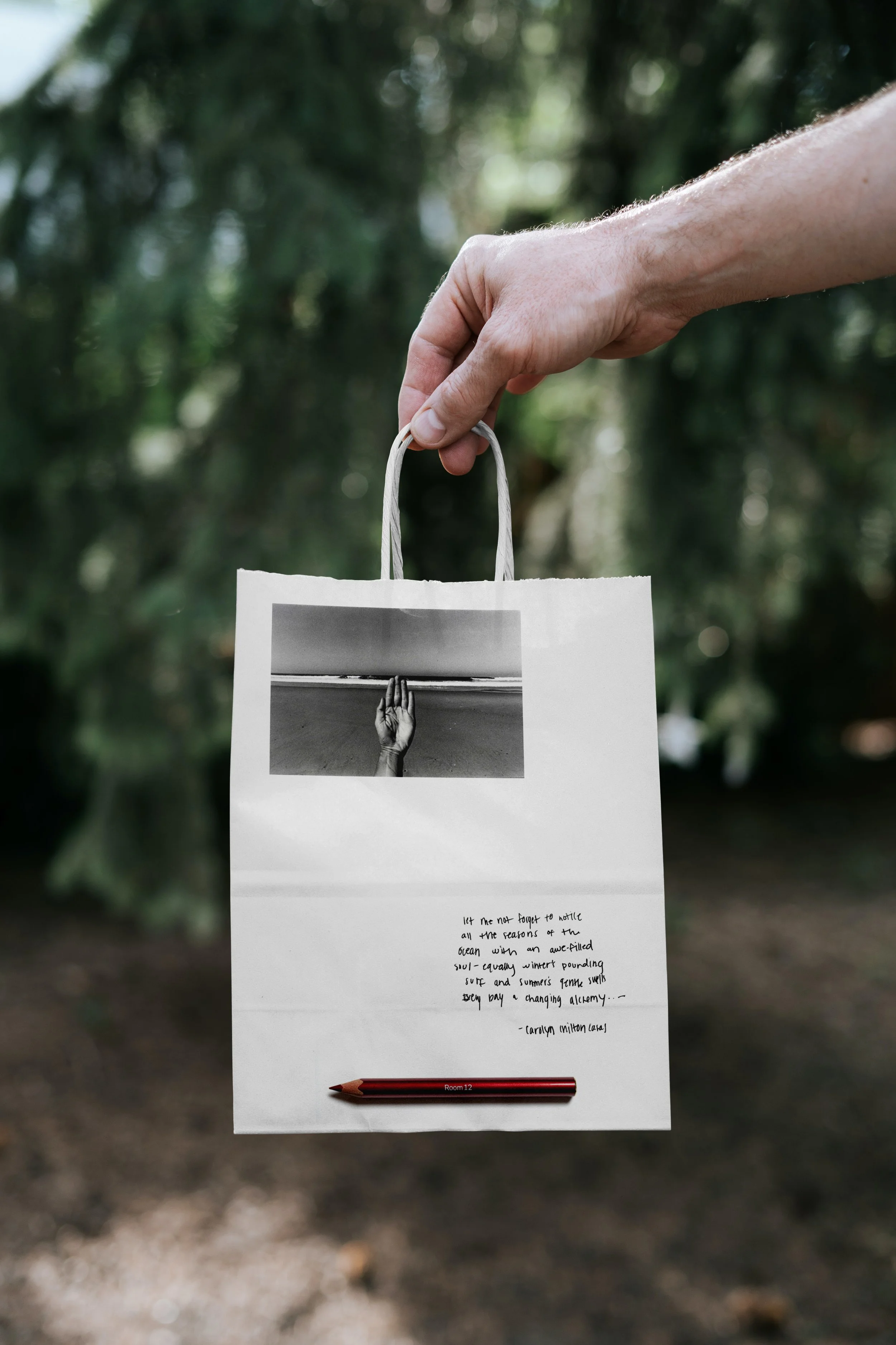
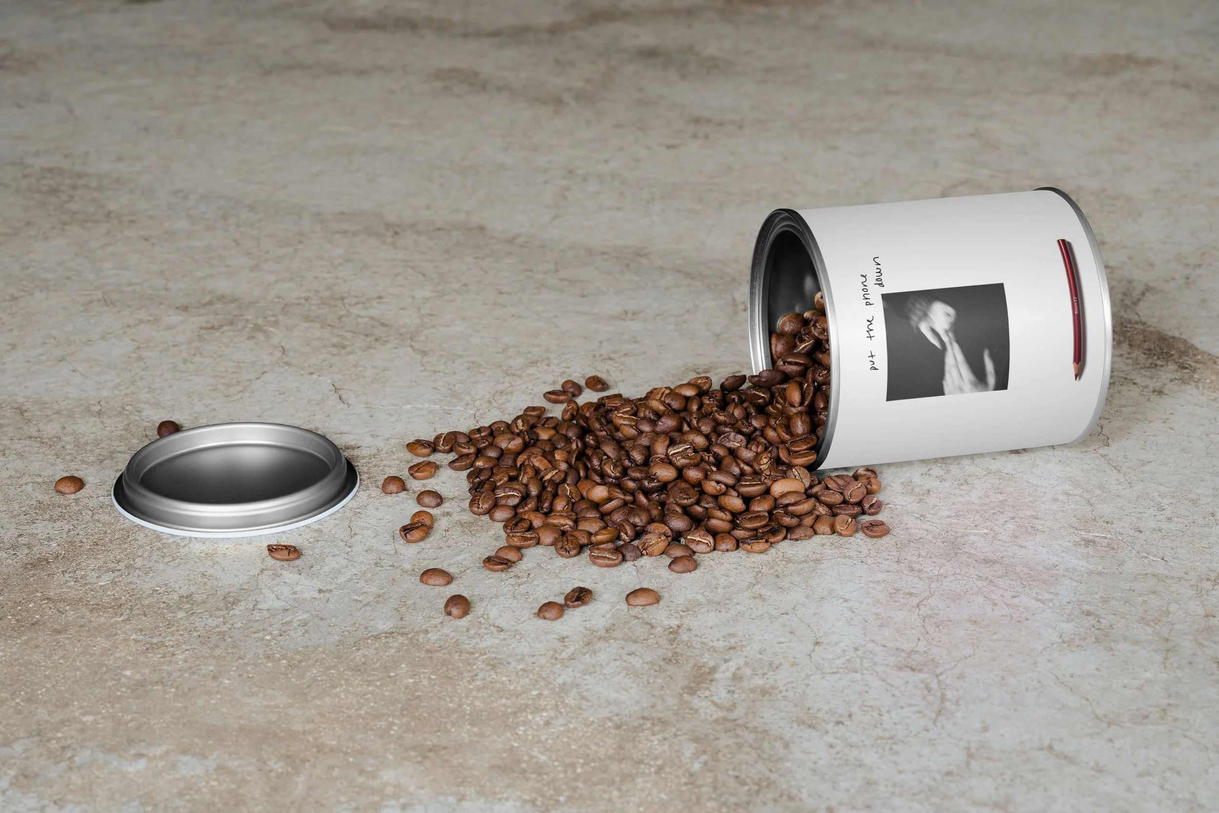
Room 12
My Freak
Coffee… Having several coffees a day, coffee is a part of my day to day routine - need it as motivation to do most tasks, source of joy and ritual
Sketching… Something that brings me creative fulfillment, encourages me to pay more mind to the beauty all around me, feels expressive/poetic
NYC… A city I’ve dreamed of since childhood, I think about a future there almost everyday
My product
My idea was to combine my interests in coffee and sketching to create Room 12—an NYC-based coffee shop where people can enjoy coffee, sketch in an intimate setting, and frame their work to become part of the evolving atmosphere.
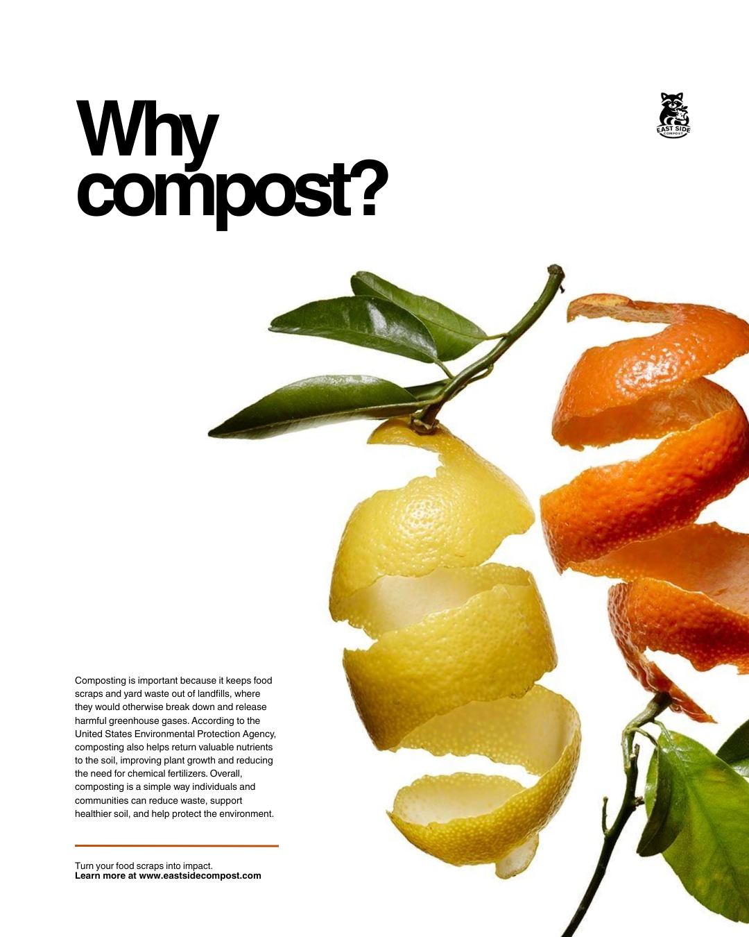
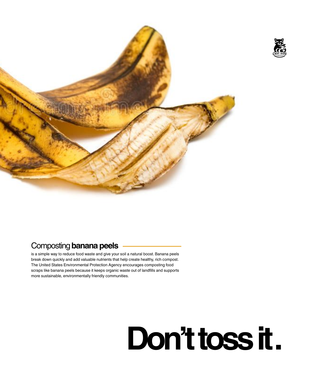
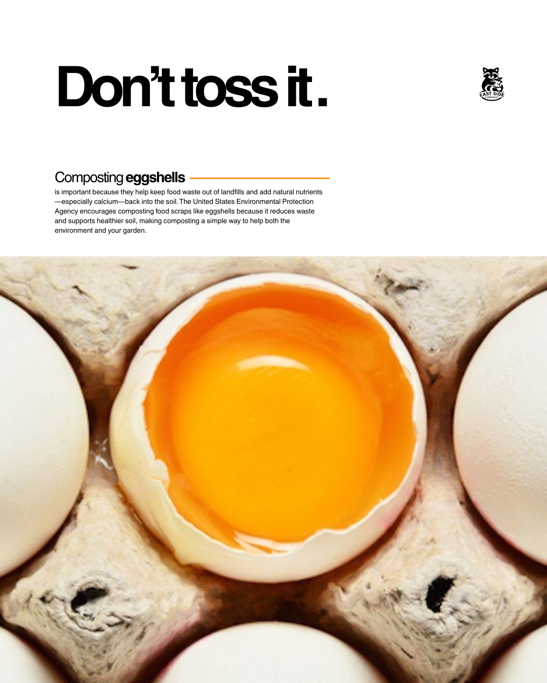
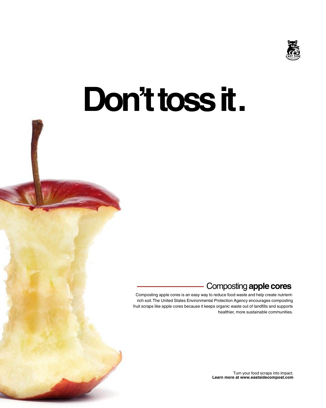
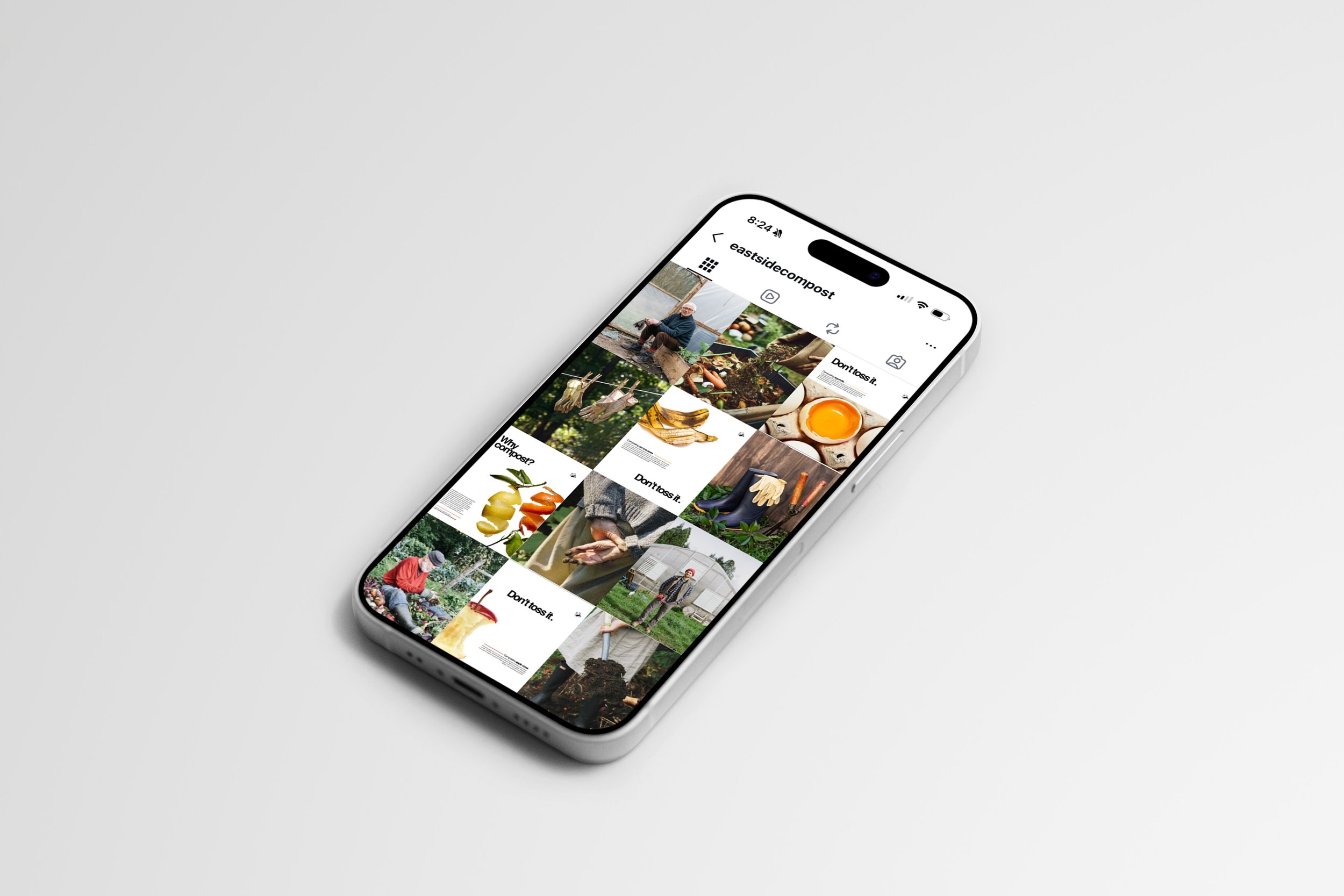
Eastside Compost
For this project, I developed a series of mock Instagram posts and a cohesive feed design for Eastside Compost. The goal was to create a clearer and more engaging visual presence that reflects the organization’s mission of reducing food waste through community composting. I designed a clean, consistent visual language using simple graphics, intentional white space, and pops of color from food scraps to make the content approachable and easy to navigate. The feed demonstrates how thoughtful design can strengthen communication, improve visual consistency, and make sustainability-focused information more engaging for audiences on social media.
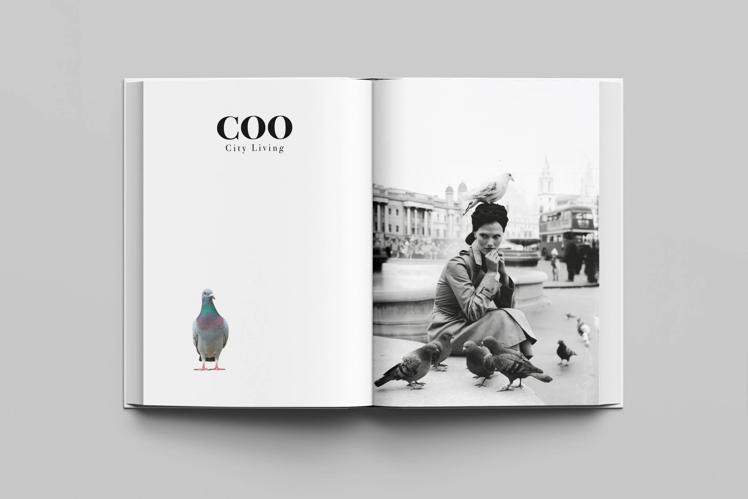
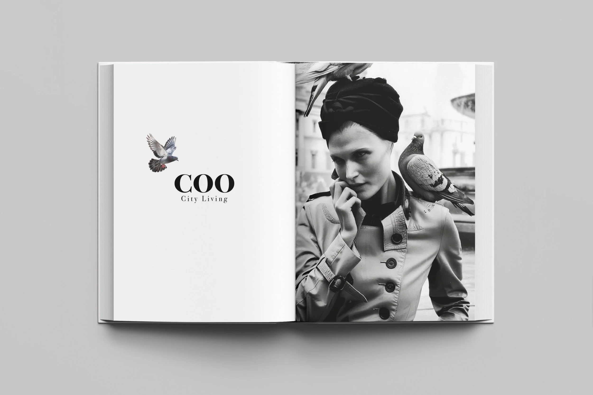
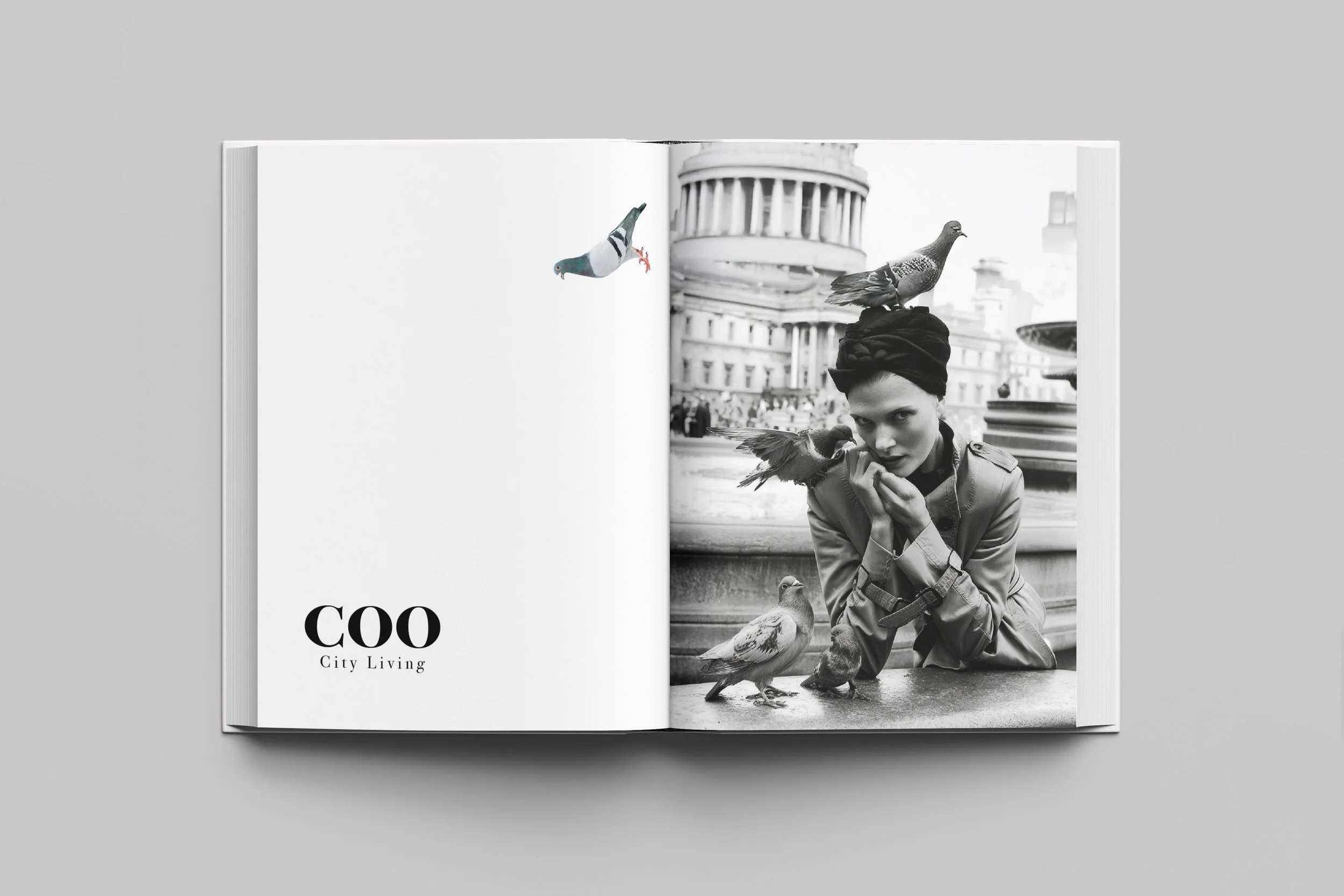
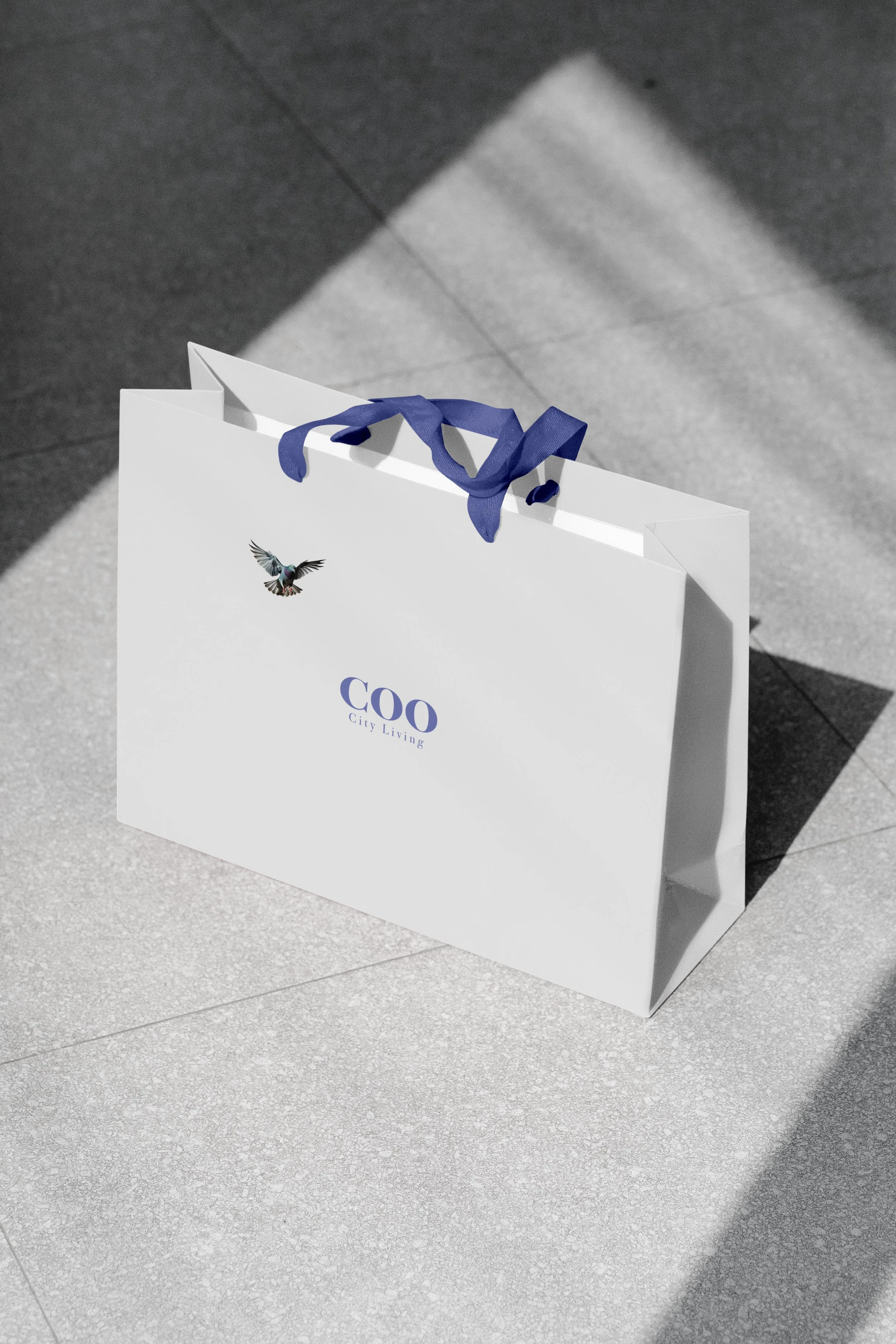
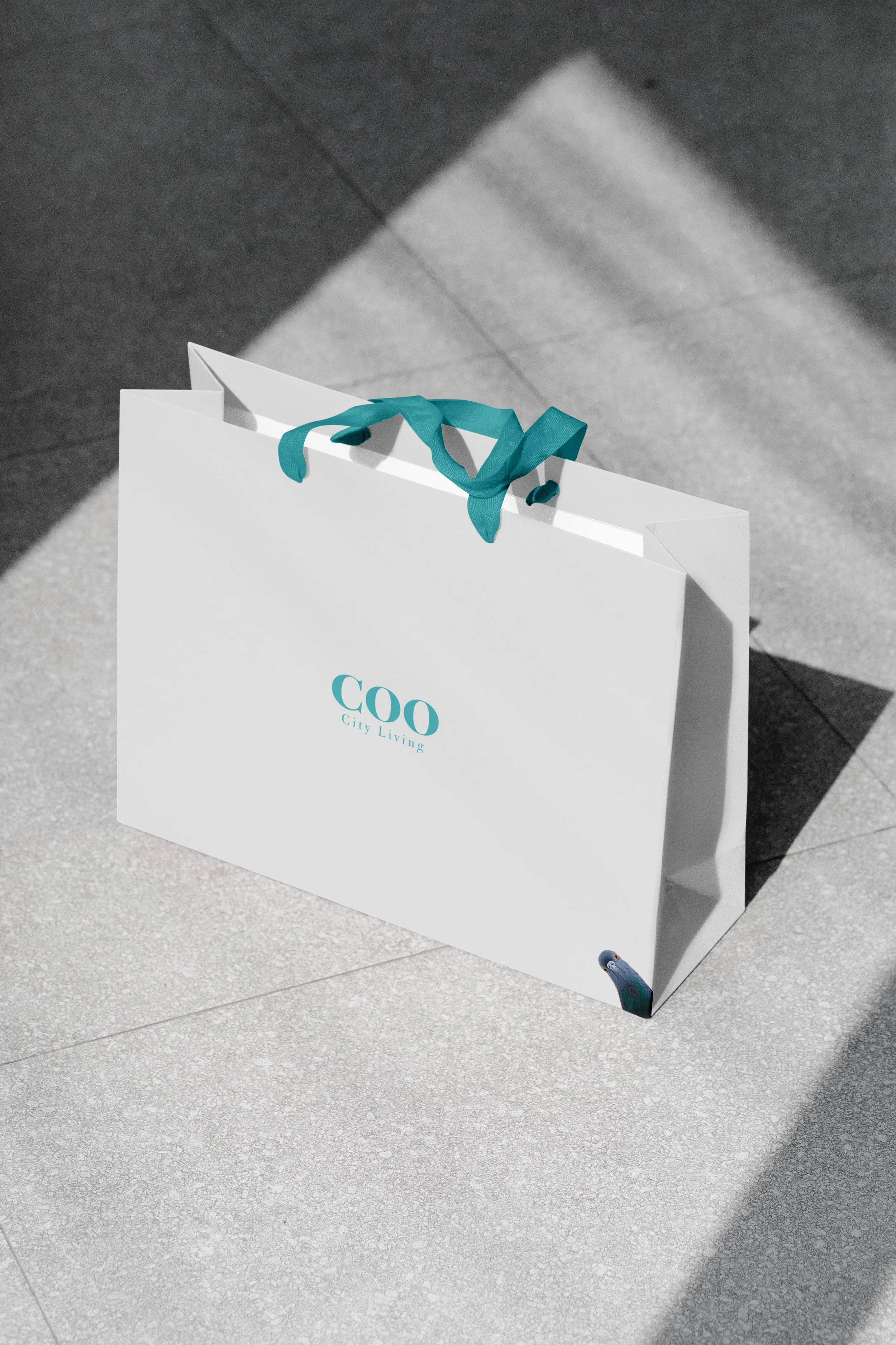
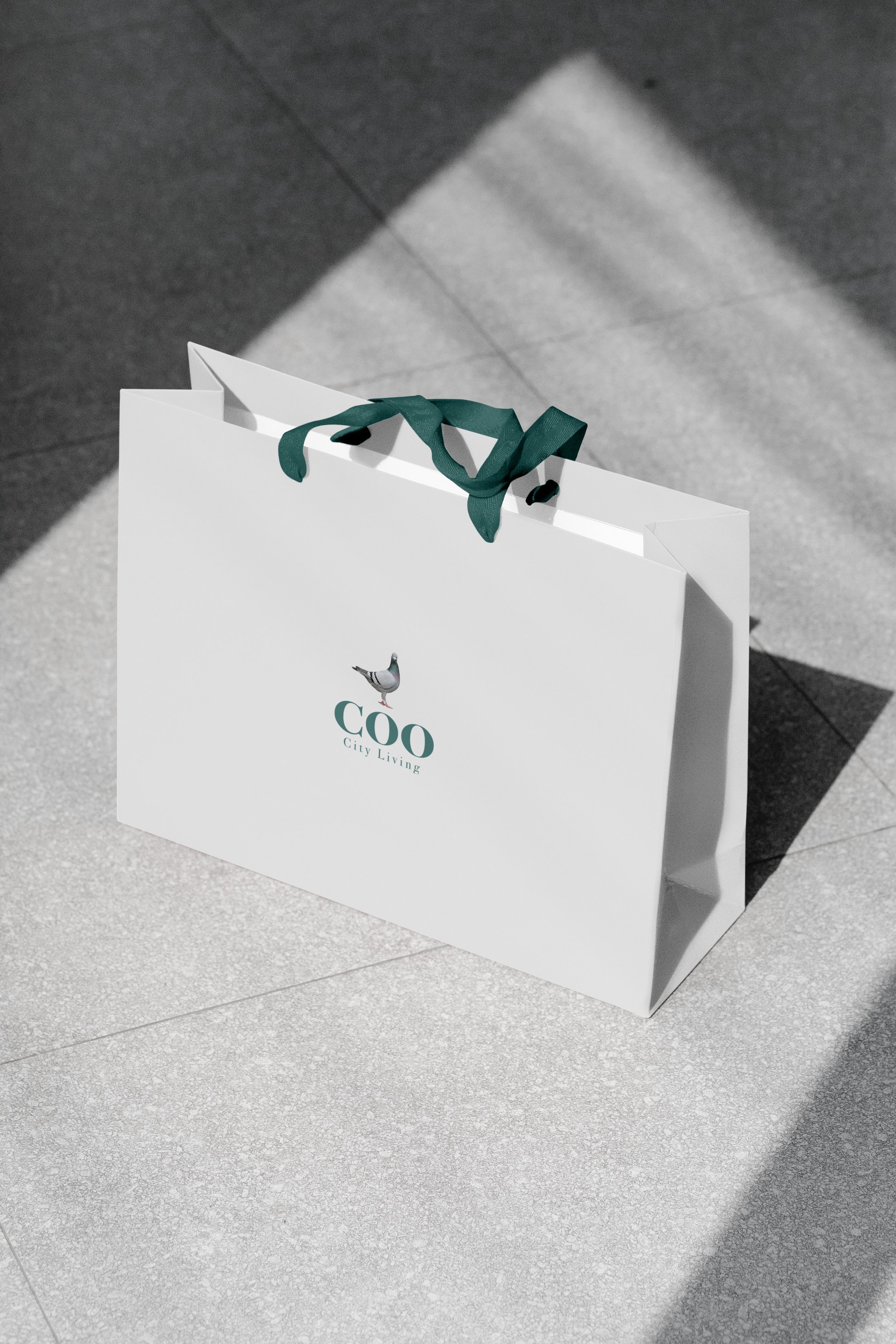
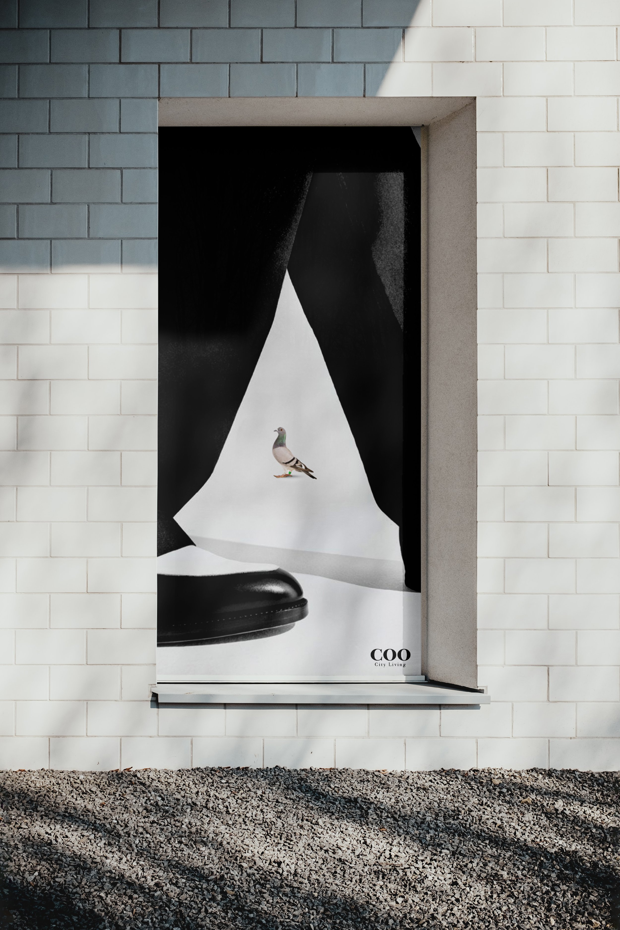
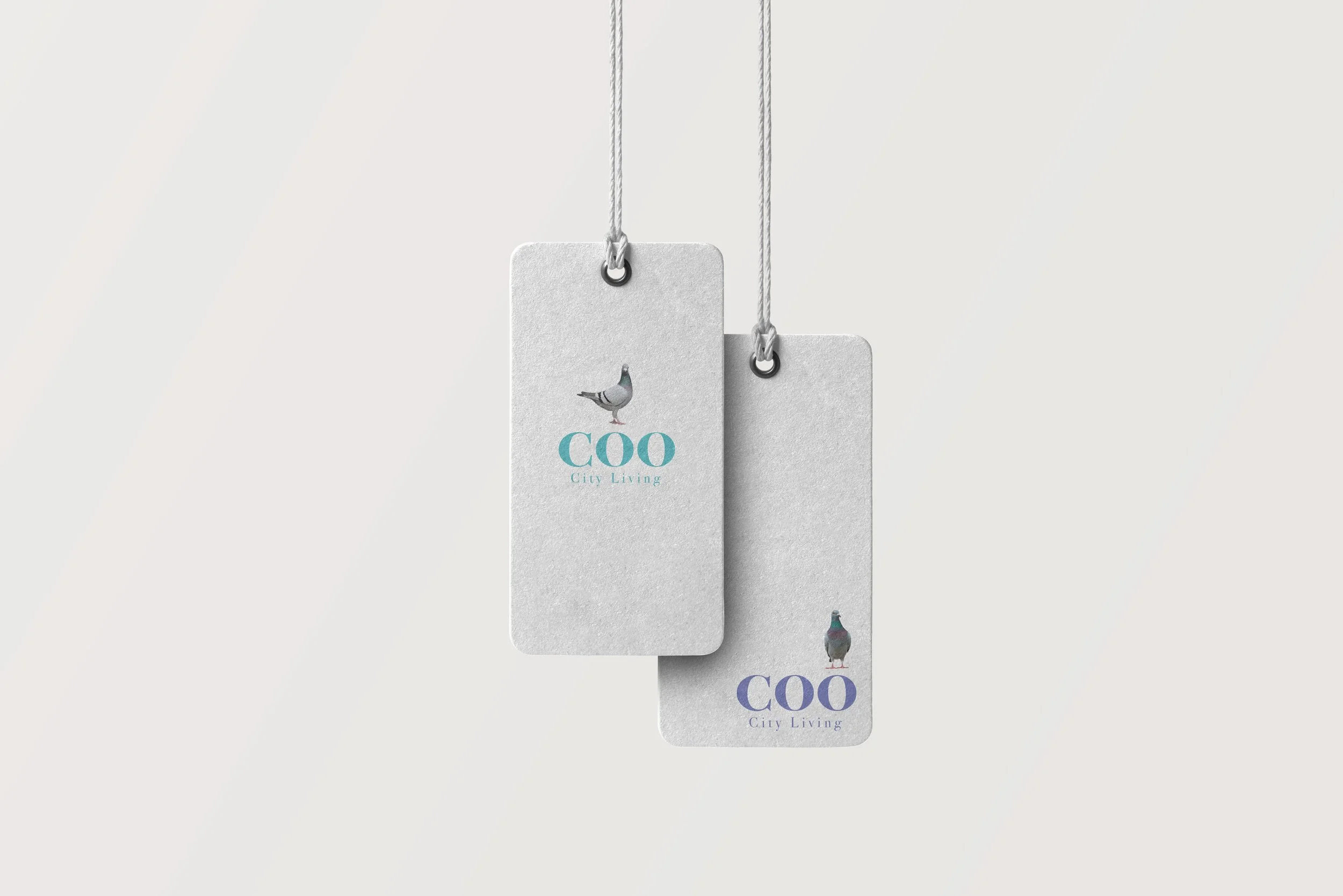
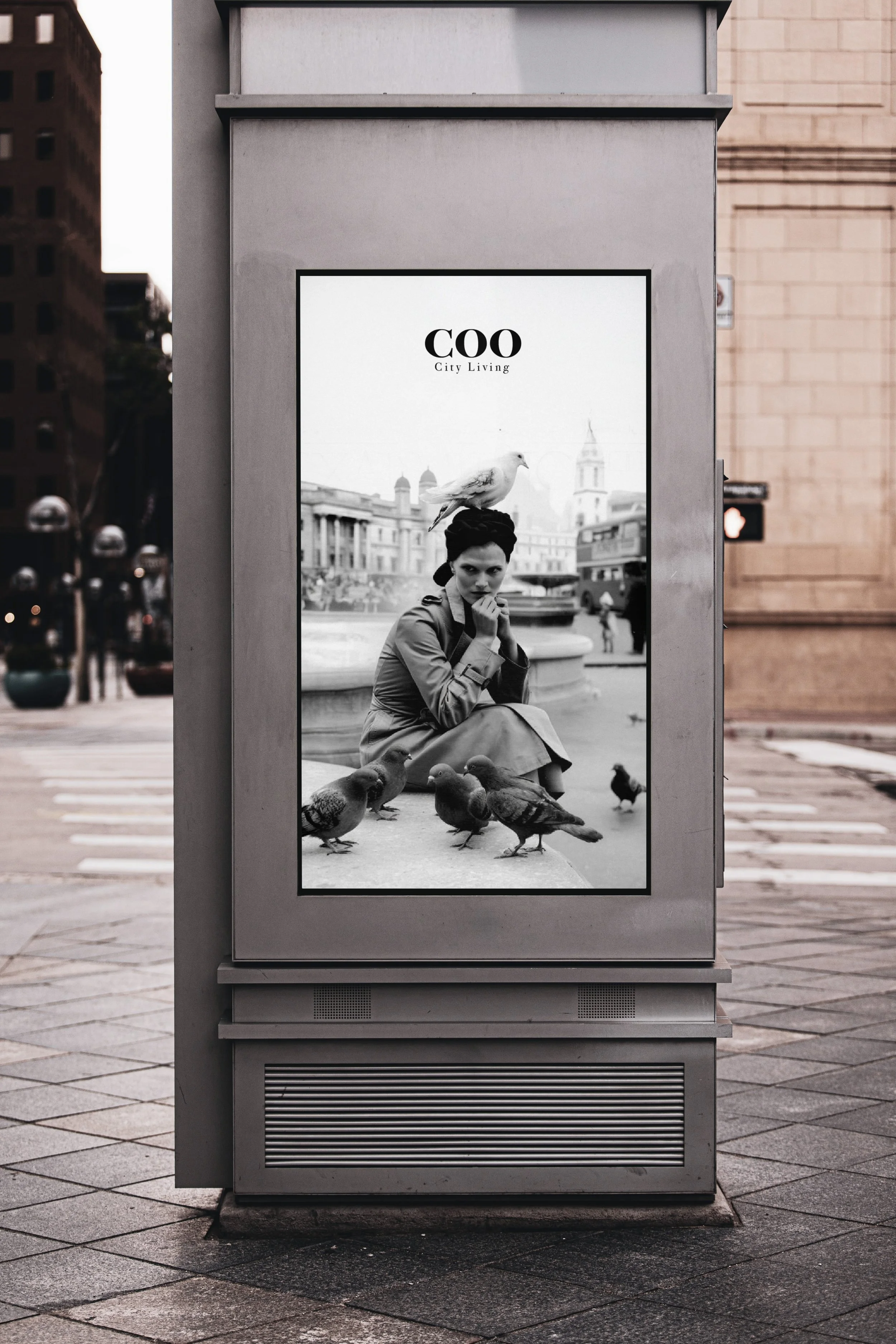
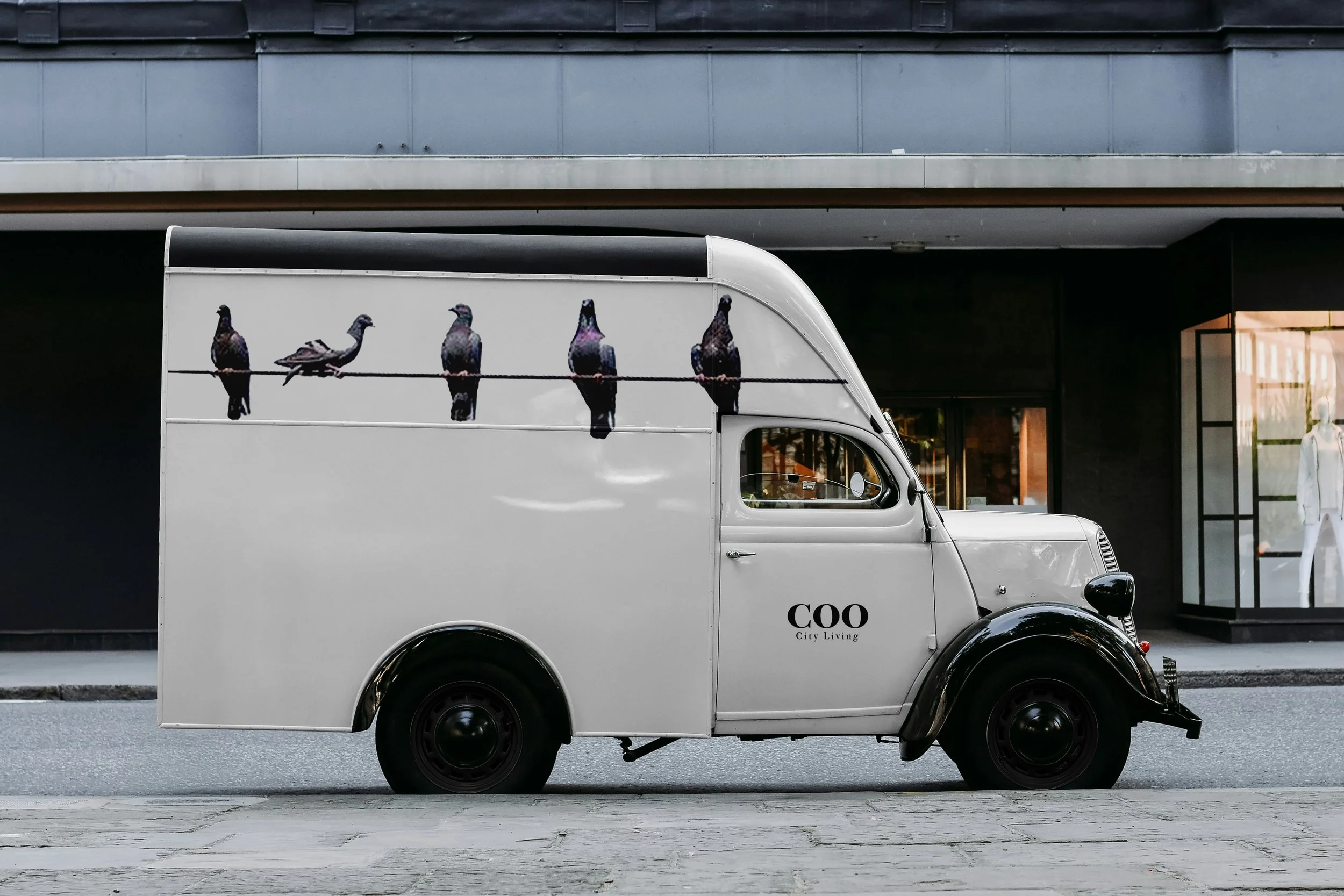
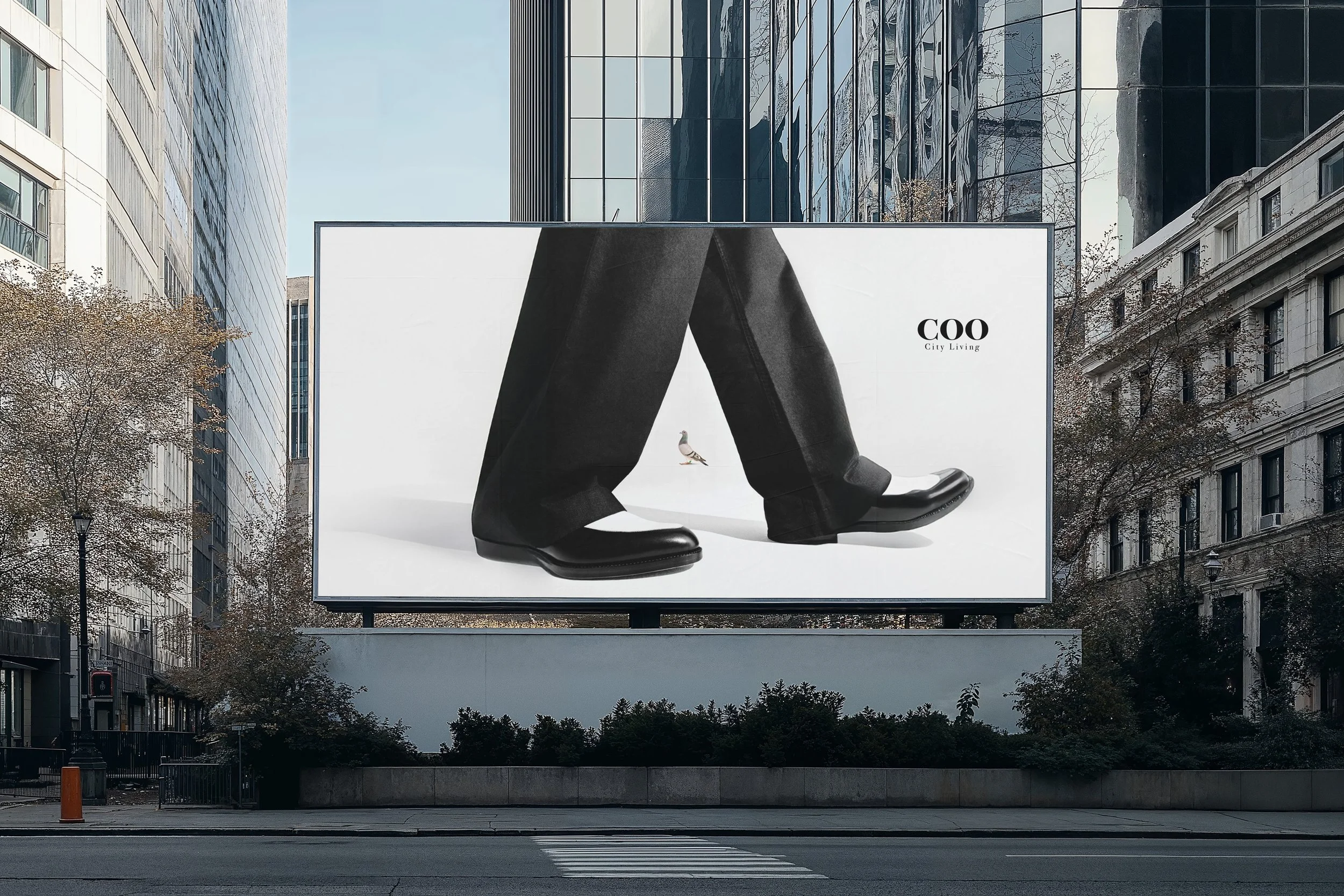
COO — City Living
This fashion brand explores the parallel between trench coats and pigeons—two elements once valued for their function and reliability that later became overlooked or stigmatized. The trench coat, originally a respected military garment associated with protection, elegance, and status, gradually became tied to “shady” cultural stereotypes, losing its original prestige. Similarly, pigeons were once trusted for communication, food, and companionship, but are now often dismissed as urban nuisances. By pairing formal, clean, English-inspired trench coat silhouettes with pigeon-based branding, the project reframes both subjects, elevating what has been discarded and challenging perceptions of value, utility, and reputation.